Hello Krafters and a Happy New Year!
Thank you to all who participated in last month’s
NATURALLY NEON Challenge. The K+ Facebook Community page is looking fabulously bright with all your neon creations.
January challenge.
It’s the New Year,
Coca-Cola Adverts Challenge.
The Kraft Plus Design Team
Happy New Year to you all. x
I essentially ‘lifted’ the image on the left hand side, though I ended up changing my black figure for red, simply because I preferred it ;) I adore this flourish stencil by Dina Wakley, it’s been featuring in a few of my creations of late, but it worked perfectly with this.
Hi All! For this month I was inspired from the mood board to use red and yellow and the flourishes grabbed my eye too.. I added a few yellow splats from the moodboard on my back ground as well.. TFL!
Hi Krafters, there was an add in the 1960's with the jingle "Things go better with Coca-Cola" so that was my inspiration for my title. Couldn't get the jingle out of my head for days!
P.S if you are wondering why, the drink captured is not a Coca Cola beverage.I have never liked the taste of the Coke Family and their drinks.
I added a heart at the bottom of the V like the bottom right pic but took my overall retro theme from the top centre pic. I love fashion throughout the decades and was rapt to be able to create this entire page with only kraft cardstock and ArtStacks papers - including the paper ruffle!
I took loads of inspiration from the mood board this month, especially the far left graphic. I picked up the orange in my photo and ran with that in lieu of the red. I was pretty happy to find some perfect Vicki Boutin embellishments and stamped some giant flowers with a Cocoa Daisy stamp I've had for years but never used.
January page - inspired by the red and yellow and the sunbursts!
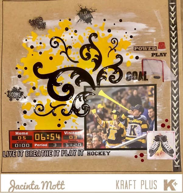
This is photo of one of my sons at an ice hockey game blowing that horrid horn! (We needed to introduce rules about when it could be blown - only at the hockey and only when a goal is scored!). This photo featured on the team’s Facebook page.
I used gesso, paint and stencils.
Guest Designer
Please welcome for this month...
Brenda Caldow
Hello everyone. I’m so pleased to be joining Kraft+ this month for the January 2021 challenge. I have been joining in here from about the time Kraft+ first started. I love the challenges and working on and with Kraft cardstock/paper. As soon as I looked at the challenge I knew exactly what I wanted to do. Red for the coke logo with just a little white along with the bright yellow for summer sunshine. I printed out some little coke bottles. I coloured some gauze with yellow and red ink. And being me I had to use flowers as they are my favourite craft item and I use them as much as I can.
Each month we are on the look-out for eye-catching projects for potential Guest Designers to join us. There is nothing extra you need to do, just share your layout or project in the Kraft+ Community Facebook page. We hope you all embrace the opportunity.
We welcome all kinds of Kraft entries for our challenges, from a traditional layout, cards, digital layouts, art journal and tags etc., just please remember that it is all about the Kraft, so we want to see Kraft as the base or ‘hero’ of your creation.
You can share your K+ creations with us on our
Facebook Kraft Plus Community Group
We no longer have the ‘linky’ tool on the blog, but would still love to see your creations. Anyone who is not on Facebook, can email us their creations and if you have a blog, a link to that so we can still visit.
Our email is kraftplusaust@yahoo.com
That's it for this month’s challenge. I do hope you find the time to join us and have fun with the challenge.
We can't wait to see what you all come up with this month :-)
Stay safe and happy Krafters.


No comments:
Post a Comment