As you know, this month we joined with the team from 'More Than Words' for this month's FOCUS ON FACES CHALLENGE. That means we have double the inspiration for you, how fabulous is that! Here's what the team from 'More Than Words' created...
A bit more about More Than Words....in their own words...
We are a papercraft challenge blog offering two challenges each month - a Main Challenge and a Mini Challenge.
Join in and have some creative fun! We have amazing sponsors and there are GREAT prizes to be won.
Dana: I
love the reckless, loose, and joyous spirit of the band FACES. Rod
Stewart's distinctive raspy singing voice is instantly recognizable and
is one of my favorites to listen to. I used a Faces concert poster that
featured mix-and-match face sections and had an absolute blast putting
the parts together to make faces (while listening to the album!) across
the center of the page. I used a black and KRAFT patterned paper for the
base of this layout and painted sections of the design to add color.
Emma: What
a challenge! KRAFT paper as my base sheet and as a tag behind my image.
For the FACES word challenge I couldn't stop singing Bowie's 'Changes'
song with the lyrics featured. So I used it as my title along with the
face image that I found on Pinterest and stencil from my stash. I also
used products from 2Crafty Chipboard.
Heikes: For
our beautiful May challenge I decided to get out some of my FACE
stamps. The collage FACE image should be my focal point. I built my
layout around this boy FACE. This was so much fun, to start a layout
with a collage image. I applied a white wash to my KRAFT background
paper, first. The
white wash should ensure that my stamped image is nice and clear. A
little bit of watercolor and stickers from 13@rts here and there, and
much more. I think the FACE photos from Tim Holtz complete my layout.
Sharon: When
I saw this challenge was about FACES, I immediately remembered photos
of my daughter that I took when she was 6 years old. She was posing for
the camera and looked absolutely adorable making her silly FACES and
wearing cool shades. I used KRAFT paper as my background and designed my
page with patterned paper and embellishments to draw your eye to the
adorable fun FACES!!
Aga: My
inspiration this month is a collage made in my art journal. Sometimes
people can't talk about their emotions, but we see on their FACES that
something is going on. We think ‘If only FACES could talk... it’ll be so
much easier.’ I used a lot of KRAFT paper elements in the background of
my collage. I tore the KRAFT paper into pieces and glued it onto old
book pages. I painted the background using acrylic paint, embossed
stamps, and I also used modeling paste with a stencil. I used 13 Arts
gesso, modeling paste, acrylic ink, stencil and stamps and AB Studio
wings from transparent foil.
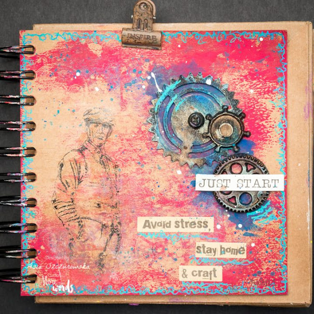
Asia: I have a art journal in KRAFT papers. I love to use saturated colors so I decided to add red and turquoise. I found a few gears that I prepared for another project and an idea for a male art journal page came up. I used a transparent foil from AB studio from which I transferred the male figure to the page. The man's FACE expresses self-confidence and self-control, and I matched the inscriptions with it.
Priya: For FACES, I used some face molds and a quote "if only FACES could talk." For KRAFT, I used a corrugated cardboard sheet.
Wow, how absolutely gorgeous are all their creations! It's been fabulous to share the fun with them, I hope you'll join in too. Don't forget to share your creation with both sites, there are some great prizes up on offer over at 'More Than Words'.


No comments:
Post a Comment